v2.0 - (06/01/23)
- v2.0.2 - Changed some links in preparation for the next site update. (06/07/23)
- v2.0.1 - Fixed the titles of existing pages and made a favicon. (06/05/23)
Welcome to Version 2 of The Last Sunrise! As stated in the index blurb, I'm rebuilding the site from the bottom up with Bootstrap. So far in this version, I've added:
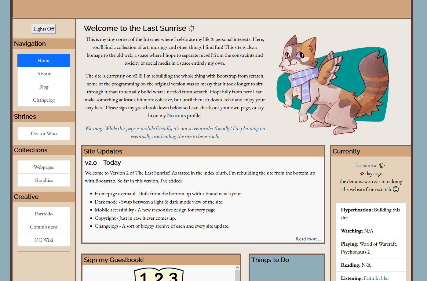
- Homepage overhaul - Built from the bottom up with a brand new layout.
- Changelogs - A sort of bloggy archive of each and every site update, think a devlog!
- Copyright - Just in case it ever comes up.
Homepage Overhaul
The big change for this new version! I burnt myself out horribly with the plushie collection on v1.0 to the point where I had a hard time working on other, entirely unrelated parts of the site. Not to mention, the original code was a trainwreck and a half, so, I decided to start over entirely! Naturally, by making it even more of a mess!

In all seriousness, I just wasn't happy with the old layout. My coding ability was rusty when I started this site and I made a lot of stupid choices that I knew were stupid as I made them. The problem was, I didn't really have any ideas for a layout, aside from the general placement of everything from v1. So I got started right away with Bootstrap as a crutch and...it didn't feel right. So I tried again from scratch with slightly more of a plan... and it still didn't feel right. It wasn't until I was idly scrolling through Pinterest one night and I stumbled on some 70s style graphic design elements that something clicked in my brain and I knew exactly what I wanted to do to make my website pop.

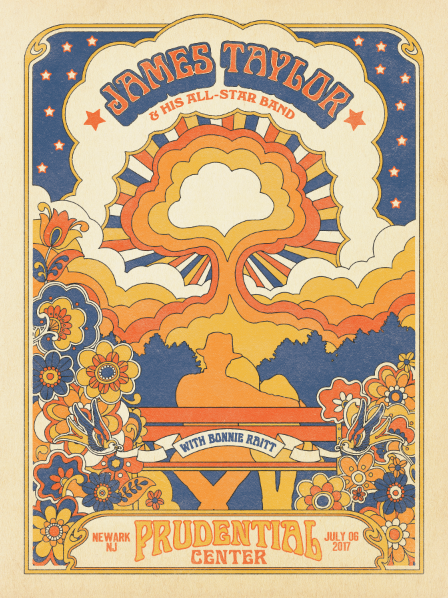
I spent that whole night researching all I could about that funky 70s graphic design style, I really liked the layouts used for posters in particular, and wanted to capture that sort of paperlike printy feel. It was this one particular poster that I desperately wanted to capture. Mostly it was the colors and the cloud motif that I loved.

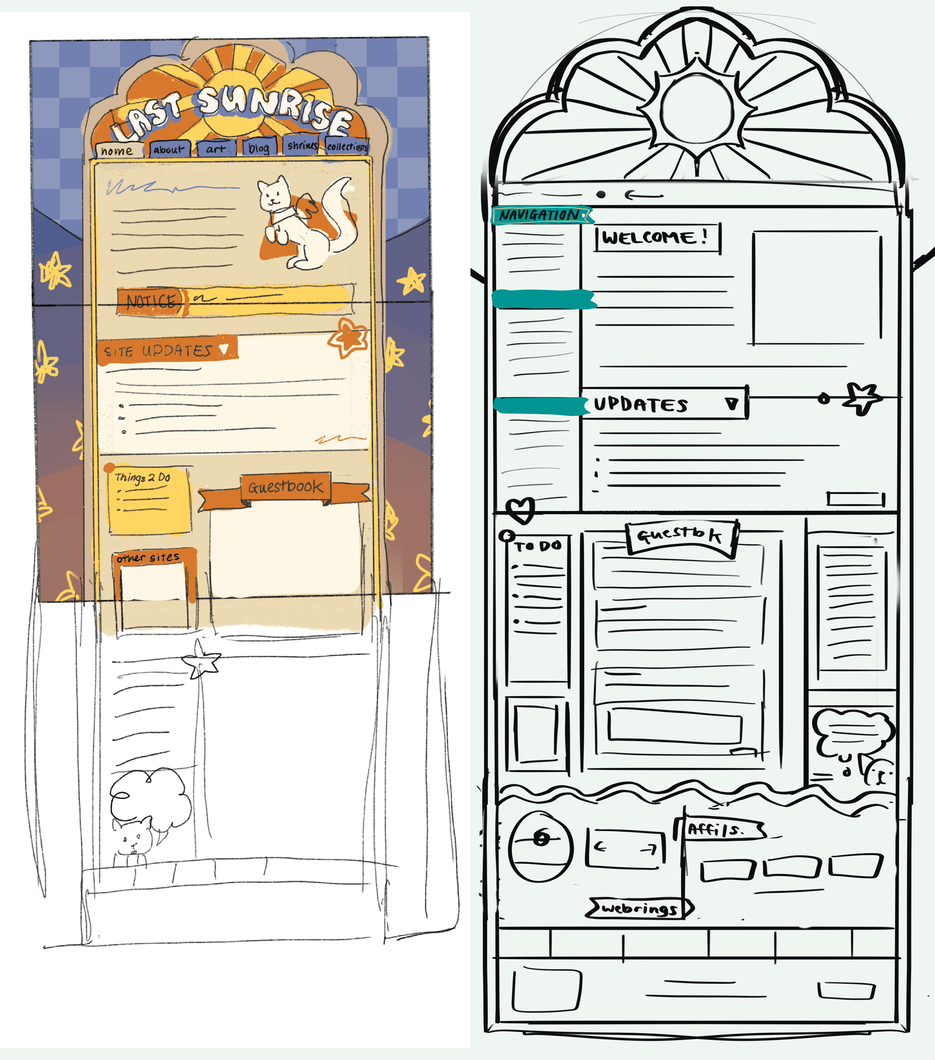
While researching, I sketched out little thumbnails on my iPad. And luckily, I got the design I wanted pretty quickly! From there it was just a matter of translating it to code. I'd also found this website recently with a lot of very retro web templates, and while I wasn't looking for a template per-se, I got a lot of inspiration from digging around the code of my favorite layouts to see how they made certain assets look the way they did. I especially liked their use of layered background images to build really unique looking websites!
And that's really all there was to it. It took a long few weeks of painstakingly measuring my Illustrator files to be pixel perfect (I realized embarassingly late that I could just lay a screenshot of the site in the background and have the exact sizing I needed. Oh well). It was so bad that I tried teaching myself Javascript in the interim, desperate times called for desperate measures, but I did get that cool live update timer on the homepage out of it!
As much as I love the final product, I'll absolutely have to tune it in the near future so that updating isn't a pain. At some point I really do want to make that dark mode and use Bootstrap for what it's actually made for and make the page responsive, but that'll be a project for another day when I feel like drawing a thousand more assets haha. For now, I'm just really happy I can show off what I've been agonizing over this last month. And hopefully, sooner rather than later, I can reboot some of the older pages I left behind too.
Changelogs
Another thing I've been wanting to do with this website is more formally archive my time building it! I want this site to be a time capsule of myself, where I can look back at my own thoughts from past snippets of time.
But more than that, I wanted to be able to inspire anyone looking into making their own sites! Sitebuilding, and just coding in general, is such a daunting thing to get into, and while this won't be a beginner's guide or anything (there's plenty of those anyways) I always find inspiration from reading blogs about people's own journeys building something. If even one person can get something out of me dumping my own thoughts and inspirations, then that makes it all worth it.
Writing this right now, I'm not quite sure what sort of format I want for these yet, and I'm sure I'll finetune it as I go. My main inspiration was the Visual Studio Code changelog, I just love how detailed and organized they are, and how they go in-depth on each change.
Eventually, I do want to make a better layout for these, as well as a hub for all of them. That'll probably come alongside with figuring out how server side scripting works so I don't use up 3 GB copying the same HTML over and over again.
Copyright
Admittedly this idea mostly came from me trying to bulk up my footer, but the more I thought on it, the more I liked the thought of having one? Overall as an artist, being able to stake my claim on my own work felt like a good idea. Not to mention, having a place to dump all the disclaimers about not owning things not otherwise clearly marked as my own. Nothing much to say on the matter, but here it is!
Next post →


