v2.2 - (10/26/23)
- v2.2.1 - Updated the Index and added a new WCN session recap & tweaked some assets on the WCN page. (11/07/23)
After an embarassingly long hiatus due to school and other life matters, I'm finally getting myself back into the programming workflow. The changes here are all centered around the hub for my active D&D campaign, but are an important step in the direction of a full creative archive for the website:
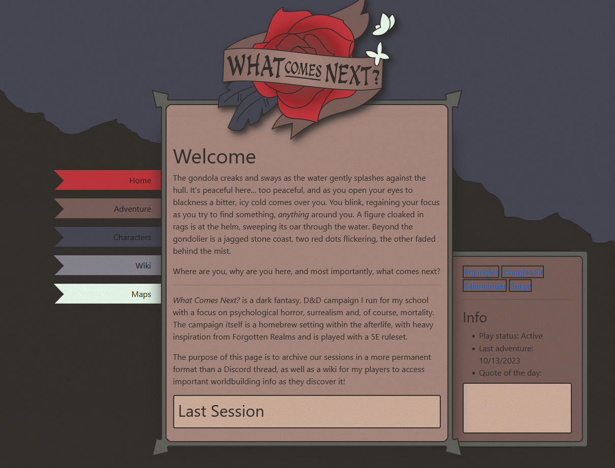
- D&D campaign page - An archival page for my current D&D campaign, What Comes Next?
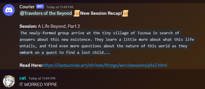
- Session RSS feed - An RSS feed for every new D&D session, specifically to integrate into a Discord webhook.
- Accessibility improvements - Small HTML changes all around the site to make it screenreader friendly.
D&D campaign page
Writing this out now, it's ironic looking at my last changelog post where I talk about motifs to tie the whole website together, regardless of how far-out the stylesheets get. In my defense, I kept 2/3 of them: the sky imagery & overlay, but I broke my font rule. Which, in the case of this page I'd say it works out, considering the dark fantasy theme.

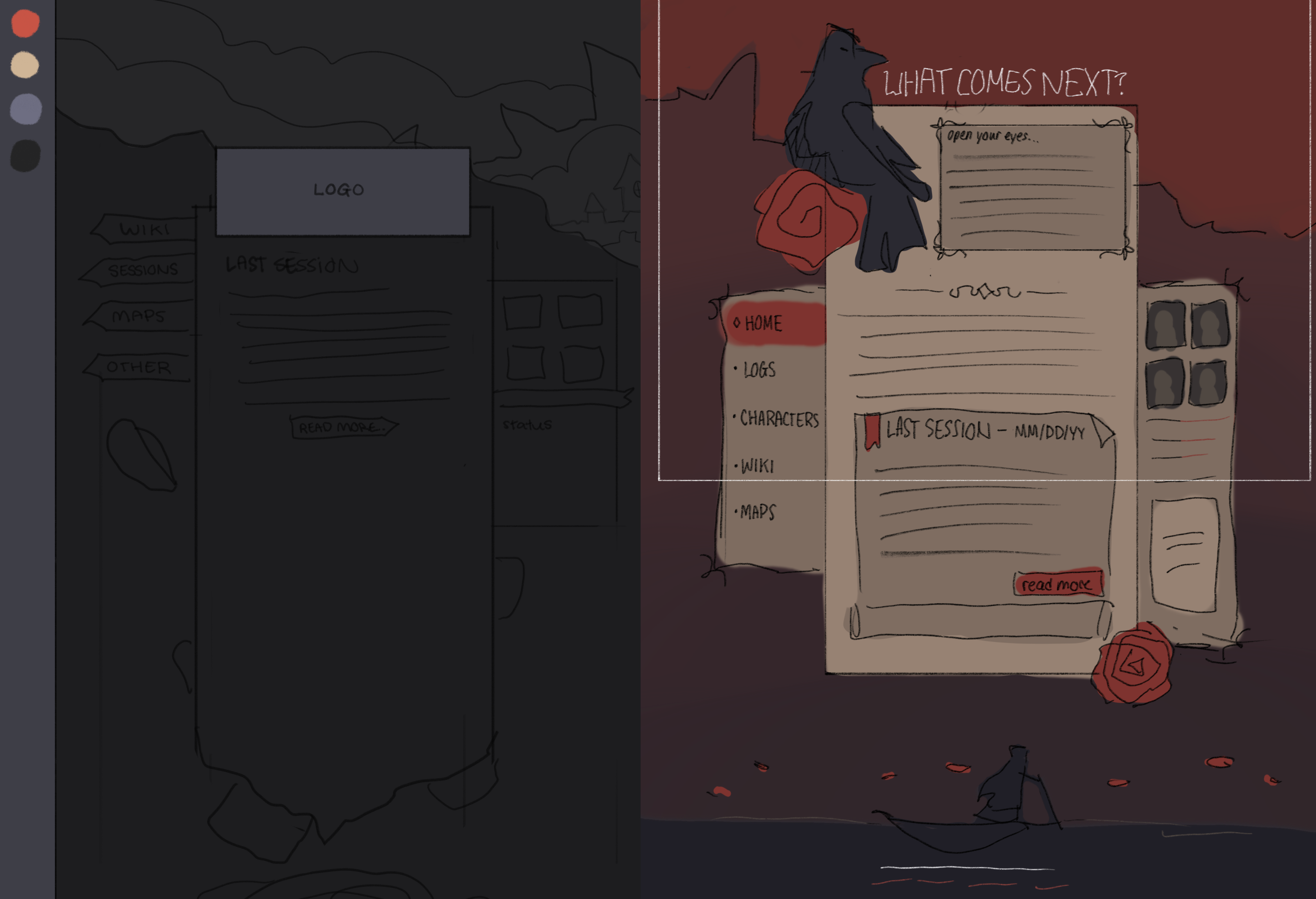
I wanted to make something that mimicked the style of the D&D 5E handbook, with the small-caps header font, and the partitions within the pages for lore blurbs. And from there, I wanted something to fit in some important, recurring motifs within the actual campaign. It was difficult getting into the groove of UI design again, especially after my long break beforehand. My first sketch for the webpage was fine, but I didn't put as much time as I'd have liked into it. I should have spent more time planning colors and patterns, because the actual execution for it fell very flat, at least in my own opinion.

But, once I got rolling with my second sketch, it was much easier building the new page from scratch. I even tried out some new CSS, all of which I'm incredibly proud of.
One of the new things I used a lot for this new section's CSS is pseudoelements! I still have a lot left to learn about their uses, especially the more niche ones, but they actually make sense to me now (as opposed to before where my eyes crossing before the second I saw two colons in my CSS). In the context of this page, I used before & after pseudoelements to stack up borders, where I'd wasted a lot of time hand-drawing and measuring out my own assets on my older pages. My head's spinning with new possibilities now that I know the basics.
Another function I discovered while putting this page together is the border-image. Here's a really good write-up on what you can do with these, but I used it for the info scroll widget on the homepage. As with pseudoelements, I've got a lot of experimenting to do in the future so I can use these to their fullest potential, but it's super nice knowing there's an easy way to have funkier borders on a website.
Not to mention, both these functions will make going back & making the site more responsive a whole lot easier, which still isn't a project planned for the near future, but it's definitely on my mind now. A whole lot more went into this page and all its subsections, which I'll go into below, but I wanted to highlight some other inspirations I held close to me as I tackled this new page!
Session RSS feed

This one's pretty self-explanatory, but I gave the D&D page an RSS feed that attaches itself to Discord & notifies my players every time I post a new recap! I've never worked with RSS before, and the extent of my XML experience is from messing around with Minecraft data files, so as with a lot of things this update I have a lot of space left to learn.
RSSGuide on Neocities was a huge help in figuring out how to make the RSS feed in the first place, and this Reddit post helped with the Webhook integration, in case anyone's interested in doing the same thing for their sites! The second guide is very image heavy with no alt text, just a heads up.
In the future I may expand and make an RSS feed for the rest of the website, but for now it's just for the D&D recaps.
Accessibility improvements
This one's an ongoing project, but I've recently started going back into some old pages and making them more screenreader friendly for any visually impaired folks! This site is, more than anything, just an archive for myself, but that doesn't mean it should be impossible to access for a whole group of people.
What this means is I've changed some of my general divs within my HTML into their semantic & audio compatible equivalents. This way, it's easy to jump around from sidebar to sidebar and section to section, and it's easier to look through the code, because everything is labelled as what it actually is.
I'm still learning, of course, these are only baby steps in terms of what true web accessibility is. But even then, it's something I'm absolutely interested in pursuing more in the future.
← Last post Next post →


